Building better selection interfaces with a Custom RadioGroup for Retool
Vaggelis Kapetanakis
Rich option layouts | Conditional display | Open source |
|---|
tl;dr here’s the repository
You’ll also find it listed in our growing open-source collection:
https://github.com/StackdropCO/awesome-retool-components
Building internal tools often means wrestling with UI components that almost do what you need. Retool’s native radio group works well for simple cases, but the moment you need grouped options, conditional visibility, icons, descriptions, or richer layouts, you start to hit its limits.
We built the Custom RadioGroup Component to solve this. It gives you a structured, flexible way to present choices, from simple yes/no selections to large, grouped option sets with conditional rules and metadata.
It’s written in TypeScript, built specifically for Retool, and designed to expose clean, predictable values while giving you full control over how options appear.
Why we built it
Here’s a real example that surfaces the problem:
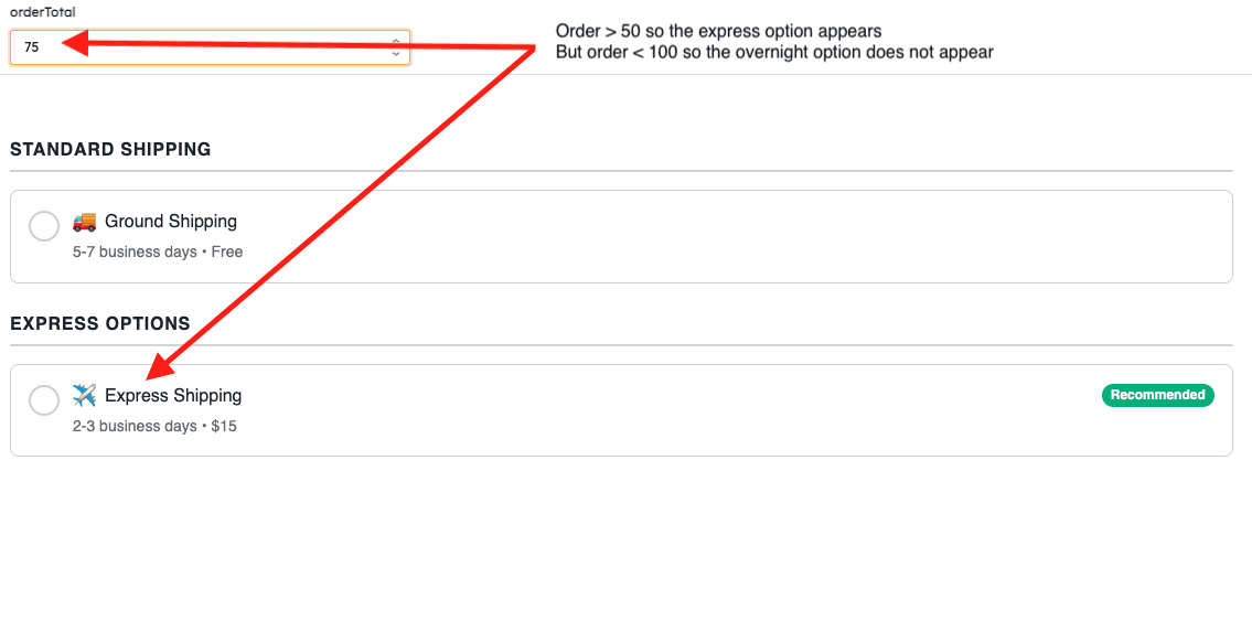
Imagine you're building a shipping method selector for an order management system. You have multiple carriers (USPS, FedEx, UPS, DHL), each with different service levels (Standard, Express, Overnight). Some options are only available for international orders, others only for domestic. Express shipping should only show for orders over $100, and you want to highlight the recommended option based on the delivery deadline.
With Retool's native radio group, you're stuck. You can display a flat list of options, but there's no way to:
Group options by carrier
Conditionally show/hide shipping methods based on order details
Add visual badges like "Recommended" or "Fastest"
Display estimated delivery times as descriptions
Show carrier logos as icons
You'd need multiple select components with complex visibility rules, separate text components for descriptions and badges, and custom JavaScript to manage the relationships between them. The result is brittle, hard to maintain, and never quite feels cohesive.
Here's the same interface with the Custom RadioGroup Component:
also:
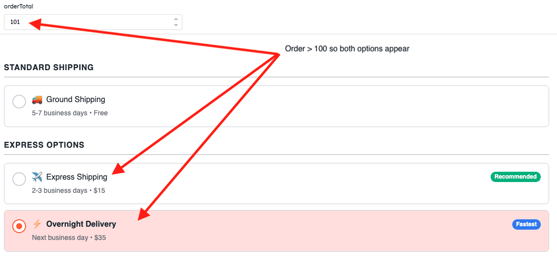
The component handles everything natively: carrier logos as icons, group headers for each carrier, conditional display rules that hide unavailable options, badges highlighting recommended choices, and descriptions showing delivery estimates. The entire selection interface is defined in a single, declarative configuration that's easy to understand and modify.
What would have taken hours of custom code and multiple components is now a clean, maintainable JSON structure.
Features
The RadioGroup Component extends basic selection with practical features designed for real-world internal tools.
Single & Multiple Selection: Switch seamlessly between radio (single) and checkbox (multiple) behavior based on your use case.
Four Layout Modes: Choose between vertical, horizontal, grid, or justified layouts to match your design needs.
Flexible Button Positioning: Place selection buttons on the left, right, top, or bottom of each option.
Rich Content Support: Add icons, badges, descriptions, and even render HTML for complex formatted content.
Conditional Display: Show or hide options dynamically using JavaScript expressions that evaluate against your app state.
Option Groups: Organize large sets of options with section headers for better visual hierarchy.
Smart Tooltips: Automatically detect truncated text and show tooltips only when needed.
Full Customization: Control all colors, typography, spacing, and visual styling to match your design system.
Keyboard Accessible: Complete keyboard navigation and screen reader support built-in.
Multiple Button Shapes: Choose from bullet (circle), square, rounded square, or diamond shapes.
Installation & Usage
Clone the repository
Install dependencies
Login to Retool & initialize
You'll need an API access token with read + write scopes for Custom Component Libraries.
Start development mode
This runs a live-watch mode that syncs changes directly into your Retool app—perfect for rapid iteration.
Deploy for production
Deploying creates an immutable version of your component library in Retool, ready for production use.
Using it in your Retool app
Drag the RadioGroup component onto your canvas from the Custom Components section.
Configure the options array with your selection items. This can be static JSON or dynamically bound to query results:
Set defaultValue (single select) or defaultValues (multiple select) to pre-select options.
Choose your layout mode (vertical, horizontal, grid, justified) and configure buttonPosition.
Customize colors, typography, and spacing to match your design system.
Access selected values via
{{ radioGroup1.selectedValue }}or{{ radioGroup1.selectedValues }}.
Quick checklist
Use the published version of the component in production, not the dev version.
Test locally with
npm run dev, then deploy withnpm run deploywhen ready.Pin your Retool app to the latest component version for stability.
For conditional display, ensure your
showIfexpressions reference valid Retool state or query data.Test keyboard navigation (Tab, Enter, Space) to verify accessibility.
For self-hosted or multi-instance setups, consider using
npx retool-ccl syncto distribute across spaces.
Example Usage
Once added to your Retool app, the RadioGroup component exposes clean, predictable values that integrate seamlessly with your app logic.
Access the selected value(s) directly from the component's exposed properties:
What's next
We've got several enhancements on the roadmap. These aren't final, but they hint at where development is headed:
Search and filter: Built-in search for option lists with 20+ items to improve discoverability.
Advanced validation: Built-in validation rules for required selections, min/max selections, and custom logic.
Technical refinements: Continued performance optimization and code quality improvements.
Get involved
We built this component to move past the limits of Retool’s native patterns and give the community a stronger foundation to build on.
If you have a feature idea, spot a bug, or want to share a new use case, we’d love to hear from you. Open an issue, submit a PR, or show how you’re using it in your apps here: StackdropCO/custom-radio-group-retool-component
You’ll also find this component (and others) in our growing community library of open-source Retool components:
GitHub · StackdropCO/awesome-retool-components
Give it a try, and happy building.